
Color has been present in art history since ancient times, even used by prehistoric artists in cave drawings. Colors evoke emotions and influence our mood, making them a vital aspect of our lives.
Regardless of the type of paint or technique you’re working with, understanding the fundamentals of color theory and color mixing will be valuable for you. Allow me to shed some light on the subject.
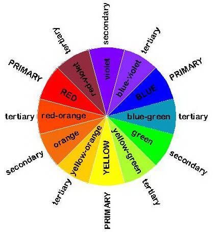
Mixing two primary colors results in a secondary color. The three primary colors are red, yellow, and blue. Combining equal amounts of two primary colors produces one of the three secondary colors as follows:

• Blue + yellow = green
• Blue + red = violet
• Red + yellow = orange
Opposite to each primary color on the color wheel is the secondary color that is derived from mixing the remaining two primary colors. These opposing hues are called complementary colors. Thus, the complementary color of red is green, yellow’s complement is violet (purple), and blue’s complement is orange.
Primary Colors
The three primary colors of pigments are red, yellow, and blue. It’s important to note that primary colors cannot be produced by mixing any other colors.
From the three primary colors, you can mix all the colors of the spectrum. In theory, mixing them in equal proportions produces black.
The primary colors of light are red, green, and blue—commonly known as RGB. When it comes to printing, the primary colors are cyan, yellow, magenta, and black (CMYK).
Interaction of Light and Color
The colors present in nature are a result of different wavelengths of light that either reflect or are absorbed by our environment. In darkness, all objects appear colorless.
When reflected rays of light enter the eye, they stimulate the retina. These stimuli are then processed by the brain, which compares them to past experiences to identify colors.
When light rays collide with an opaque object, the surface absorbs some rays and reflects the rest. We percieve the reflected as the color of the object. For example, a red object absorbs blue and green light, reflecting red.
On the other hand, a white surface reflects the entire color spectrum, while black absorbs all rays. This interplay of absorption and reflection determines the colors we see in our surroundings.
Sir Isaac Newton’s Color Theory
The creation of the first color wheel is attributed to Sir Isaac Newton (1642-1727), an English mathematician and philosopher.
In 1666, Newton made a groundbreaking discovery. By allowing the sun’s rays to pass through a triangular glass prism, he observed a separation into the colors of the rainbow, which he termed the spectrum. Newton successfully demonstrated the conversion of these colors back into white light using a second prism.
The spectrum consists of the colors red, orange, yellow, green, blue, indigo, and violet. Newton’s color theory was published in 1704 as part of his treatise, “Opticks.”
Two Systems of Color Mixing of color mixing
Color mixing occurs in two systems: one involves the blending of pigment materials, and the other involves the mixing of light rays.
1. Additive Color Mixing
Additive color mixing takes place when light rays mix. In this system, the primary colors are red, green, and blue. The abbreviation RGB is derived from the names of these three colors. The result of their combination is the formation of white light.
The mixing of light rays allows for the creation of more than 16 million colors.
2. Subtractive Color Mixing
Subtractive color mixing involves the mechanical blending of pigments. As these pigments mix, their reflectivity decreases, and light is subtracted from them. The primary colors in subtractive color mixing are blue, red, and yellow.
The color of painting pigments becomes visible due to reflected light. Theoretically, combining the three primary pigments—red, blue, and yellow—should result in black. However, depending on the purity of the paint materials, this mixture might produce dark brown or grey instead.
Color pigments, produced chemically and blended with various binders, come in different forms such as oil paint or water-soluble paints like watercolors, acrylics, and tempera. The basic colors in printing are cyan, yellow, magenta, and black (CYMK).
Complementary Colors
Colors opposite each other on the color wheel are known as complementary colors. Each primary color has a complementary color, which is a secondary color formed by mixing the other two primary colors.
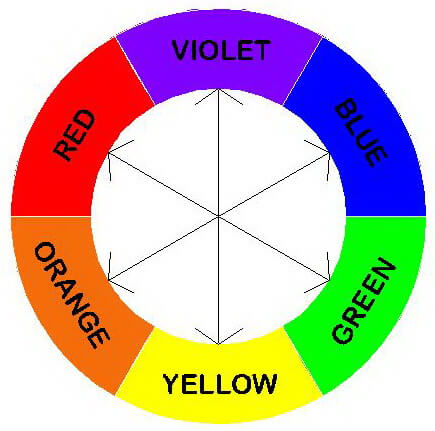
Yellow’s complementary color is violet, achieved by mixing blue and red. Blue’s complementary color is orange, formed by blending red and yellow. Similarly, red’s complementary color is green, obtained through the combination of yellow and blue.
On the flip side, each secondary color’s complementary color is the primary color not contained in that specific secondary color.
When you mix two complementary colors, the result can be gray, brown, or black.
Complementary Colors Are Also Contrasting Colors
Placing complementary colors side by side is a powerful technique to enhance color contrast and intensify their vividness. Complementary colors not only allow you to express light and shadow but also create captivating cold-warm contrasts.
To maintain harmony and avoid excessive contrast, consider incorporating color transitions and grays obtained by mixing complementary colors.
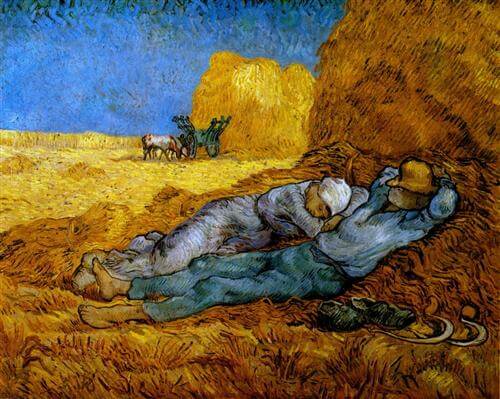
Vincent Van Gogh’s painting, “Noon – Rest from Work,” serves as an excellent example. In this piece, he applied blue and orange, a range of color variations, transitions, and grays.
What Are Tertiary Colors?
Tertiary colors are located between primary and secondary colors on the color wheel. They are created by blending a secondary color with the primary color adjacent to it on the wheel.
For instance:
- Red-orange is between red and orange.
- Red-violet lies between red and violet.
- Yellow-green sits between yellow and green.
- Yellow-orange is located between yellow and orange.
- Blue-violet is positioned between blue and violet.
- Green-blue is between blue and green.
Analogous Colors
Analogous colors refer to primary and secondary colors that are adjacent to each other on the color wheel and therefore harmonize with each other.
Examples of such color families include:
- Yellow, yellow-green, and green
- Red, red-orange, and orange
- Blue, blue-violet, and violet
- Violet, red-violet, and red
Understanding Cool and Warm Colors
Warm colors, associated with yellow and red, create a sense of warmth and are often linked to fire and the Sun. On the other hand, cool colors, linked to blue, evoke a sense of coldness and are associated with ice and water.
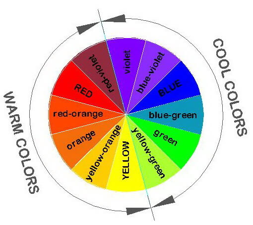
When we mix yellow with another color, the result is a warmer color. Conversely, adding blue produces a cooler color. In terms of spatial perception, warm colors appear to approach us, while cool colors create a visual effect of moving away.
Final Thoughts
Understanding the basics of color theory is valuable for everyone, given the significant role colors play in our lives.
In color theory, secondary colors are created by blending two primary colors—red, yellow, and blue. These primary colors cannot be produced by mixing other colors. The resulting secondary colors are as follows:
- Red and yellow create orange.
- Yellow and blue combine to form green.
- Blue and red result in purple.
Each primary color has a complementary secondary color directly opposite it on the color wheel. Complementary pairs include blue and orange, red and green, and yellow and purple.
Tertiary colors are formed by blending a secondary color with the neighboring primary color on the color wheel. This process creates colors like yellow-orange and yellow-green related to yellow, red-orange and red-purple related to red, and blue-green and blue-purple related to blue.
We invite you to share your thoughts, questions, or experiences by leaving a comment below. If you find this blog post useful, please share it on your social media, and feel free to explore further articles on our website.

Debora
My name is Debora, and I’m the founder of Drawing Fundamentals. I work as a civil engineering technician. I acquired the basic knowledge necessary for freehand and technical drawing during my school training, further developing and perfecting these skills throughout my years in the profession. Through my blog, I aim to assist anyone interested in learning to draw.