")
If you use colors to make your artwork, you’re probably interested in the subject of color contrast in visual arts. Painters at different stages of art history have produced breathtakingly beautiful works through the use of color contrast. The techniques they have developed and applied are timely and valuable to us, regardless of whether we create our works using traditional techniques or modern digital tools.
Color contrast is an artistic effect achieved by applying two colors with opposite properties side by side. The larger the difference, the more intense and extreme the contrast. There is a contrast between small and large, cold and warm, dark and light. Contrast is one of the basic principles of composition in visual arts. By using two or more contrasting colors together, you can achieve different artistic effects. By applying the logical, objective principles of color contrast, you can achieve order in your works of art. Swiss expressionist painter and art teacher Johannes Itten identified seven types of color contrast:

1.Contrast of hue
2.Contrast between light and dark colors
3.Contrast between cold and warm colors
4.Complementary contrast
5.Simultaneous contrast
6.Contrast of saturation (contrast of quality)
7.Contrast of extension (contrast of quantity)
The 7 Types Of Color Contrast by Johannes Itten
Color contrast is the difference between two color effects.
The developer of the principles of color contrast was Johannes Itten (1888-1967), a Swiss expressionist painter and teacher at the famous Bauhaus school. He was a prominent figure in the teaching of color theory in the 20th century. In his major book The Art of Color, published in 1961, he describes 7 types of color contrast.
Johannes Itten uses the 12-part color wheel to illustrate the relationship between colors. It consists of primary, secondary, and tertiary colors.
1. Contrast of hue
The easiest way to achieve contrast is to apply clear, intense colors side by side, using the three primary and three secondary colors.
The most basic and sharpest contrast is between the three primary colors, red, yellow, and blue. The contrast between secondary colors (orange, violet, green) is milder than that between primary colors, and the contrast between tertiary colors (blue-green, blue-violet, yellow-green, yellow-orange, red-violet, red-orange) is even milder.
By using black and white, you can further enhance the effect of each color. When combined with black, individual colors appear lighter, and when combined with white, they appear darker.
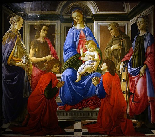
Throughout art history, many painters have used hue contrast in their works, such as Botticelli or Picasso. Also, as an element of folk art, the contrast of hue often occurs in the culture of different nations.
2. Contrast between dark and light (light and shadow)
The most extreme color contrast between dark and light is observed between black and white. There are countless shades of gray between them.
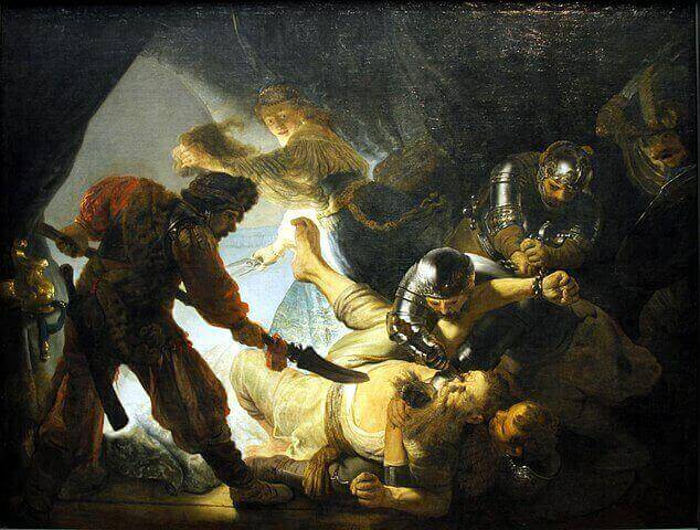
The technique of depicting light and dark is called chiaroscuro, which Rembrandt masterfully applied in his works of art.
Leonardo da Vinci’s Mona Lisa is also an excellent example of the contrast between dark and light colors, but Chinese and Japanese ink drawings are also based on the contrast between dark and light.
Achromatic grays are neutral, but the colors around them can affect the way we see these grays. The eye sees the neutral gray tinted with the complementary color of the primary next to it. Gray also weakens the vividness of the colors next to it.
Johannes Itten defines yellow as the lightest hue and purple as the darkest, so the highest hue contrast is observed between those two colors.
3. Contrast of cold and warm colors
The division into cold and warm colors is based on the feelings they evoke in us. Yellow and red are associated with the colors of sunlight and fire, and blue is associated with ice.
The color wheel can be divided into two parts by an axis, with warm colors on one side and cold colors on the other.
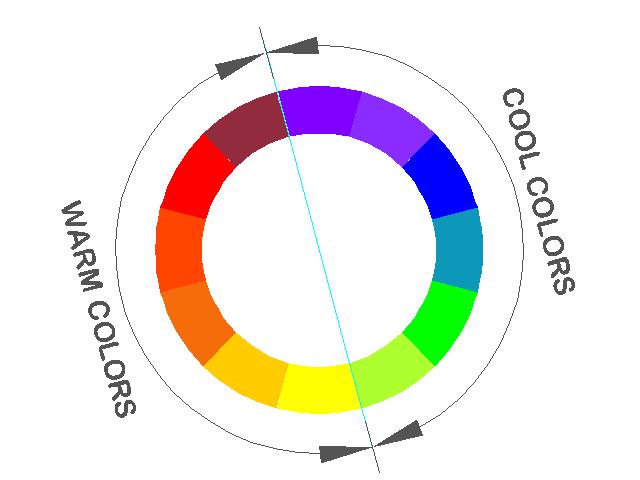
Warm colors include colors related to yellow and red, which are yellow, yellow-orange, orange, red-orange, red, and red-violet. Cold colors are colors related to blue, which are yellow-green, green, blue-green, blue, blue-violet, and violet. The warmest color is red-orange and the coldest is blue-green.
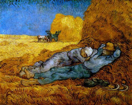
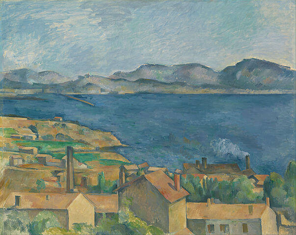
With the contrast of cold and warm colors, we can depict the depth of space in our works of art. Cold colors always seem more distant than warm colors. Things further away in space will be bluish due to the atmosphere.
While on the subject of creating depth in drawing and painting, you may also wish to read my article on the principles of perspective.
We can also depict light and shadow with cold and warm colors. We use cold colors to express the coolness of the shadow, and warm colors can be used to represent light.
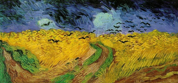
Impressionists often used the contrast of cold and warm colors in their landscape paintings, as we see in Vincent van Gogh’s painting below.
4. Complementary contrast
Colors that are diagonally opposite each other on the color wheel are called complementary colors.
Complementary color pairs consist of a primary and secondary color in such a way that this secondary color does not contain the primary that is complementary to it.
Complementary color pairs are yellow and purple, red and green, and blue and orange. Any complementary color pair contains all three primary colors. The mixture of these color pairs results in gray, which is a harmonious color effect for the human eye. The use of complementary colors side by side creates a balanced effect.
Combinations of complementary colors create a pleasing, harmonious image for the eye. When placed side by side, the complementary colors amplify each other’s effect.
The sharp contrast between complementary colors can be muted by using both color transitions and chromatic grays.
Vincent van Gogh used blue and orange in his painting below along with color transitions and grays.
5. Simultaneous color contrast
Simultaneous color contrast is based on the principle that the human eye simultaneously requires the complementarity of a particular color seen. Therefore, it spontaneously pairs the color with its complementary counterpart, even if it is not present.
Johannes Itten mentions two experiments on this phenomenon:
- If we look at a red object for a while, for example, and then close our eyes, the afterimage we see will be green, which is the complementary color of red. We can repeat the experiment with any color, and the afterimage will be the complementary pair of that color in each case.
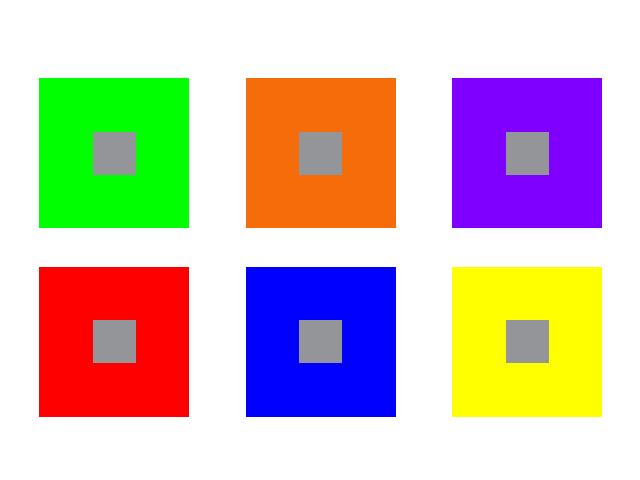
- If you draw a smaller gray rectangle in the center of a pure-color rectangle, you will see gray tinted with the complementary color. Thus, the gray in the yellow rectangle will be seen as purple-gray.
This phenomenon occurs even if it is not a primary color and a gray, but also any two non-complementary colors. Both colors are perceived as moving toward their complementary color.
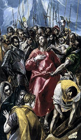
An example of simultaneous color contrast can be seen in El Greco’s painting Disrobing of Christ, using the colors blue, red, and yellow, as well as grays.
6. Contrast of saturation (contrast of quality)
Saturation, or quality contrast, is created by juxtaposing saturated, bright, clear colors and muted, diluted colors. There are several ways to mute colors. We can mix them with white, black, gray, or their complementary pair.
The vividness of color is always relative, depending on the color next to it. The same color when paired with a dimmer color looks brighter, but with a brighter color, it looks dimmer.
If we use only the contrast of saturation in our artwork, we must always use the dimmed versions of the selected bright, clear color as contrast (such as bright red and dim red), otherwise, other contrasts will also occur (such as cold-warm contrast).
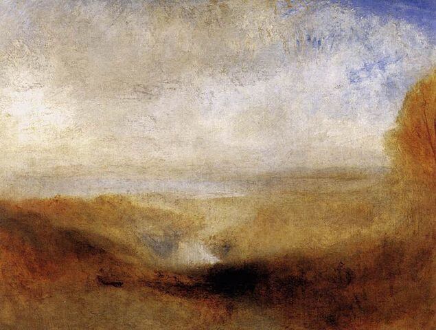
In the paintings of Joseph William Mallord Turner, the contrast of saturation is beautifully depicted.
7. Contrast of extension (Contrast of quantity)
The contrast of extension or quantity contrast can be achieved by applying one color in larger patches than the other colors.
If you want to create a harmonious artistic composition, the amount of each color must be determined to be in balance. In this, we have to rely mostly on the judgment of our eyes, because we cannot determine the area of the various color spots with mathematical accuracy.
Goethe determined the brightness of the colors in numbers and based on this he determined the harmonic ratio of colors:
Yellow (9): orange (8): red (6): purple (3): blue (4): green (6). Based on this, the ratio of complementary colors is as follows:
- Yellow : violet = 1/3 : 3/4
- Red : green = 1/2 : 1/2
- Orange : blue = 1/3 : 2/3
These ratios are valid when using pure colors.
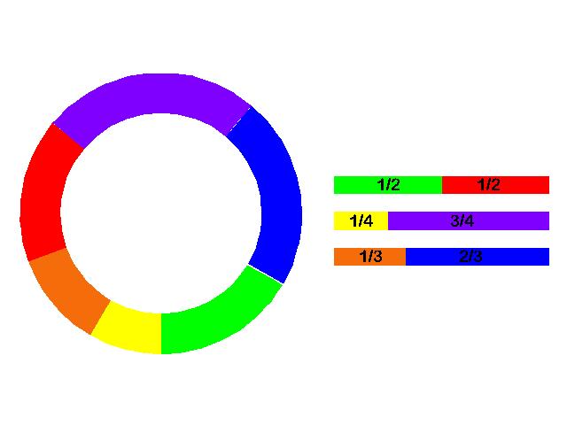
When we change these proportions, the balance of colors in our work of art will disappear and a single color will dominate. The color we used in smaller quantities will look more vivid in this case.
Final thoughts
Great masters of fine arts like Leonardo da Vinci, Rembrandt, and Vincent van Gogh have made dramatic effects by applying color contrasts to their works of art.
We can implement these techniques of old masters and modern painters, whether we are creating art with traditional techniques or using modern technology.

Debora
My name is Debora, and I’m the founder of Drawing Fundamentals. I work as a civil engineering technician. I acquired the basic knowledge necessary for freehand and technical drawing during my school training, further developing and perfecting these skills throughout my years in the profession. Through my blog, I aim to assist anyone interested in learning to draw.